Last updated: 2022-12-07
Created in partnership with Disability Services Program (DSP) Assistive Technology Specialist, Caroline Newcomb.
This article covers core skills for document accessibility including:
- Font
- Color
- Hyperlinks
- Document Structure: Styles (Headings) and Lists
- Alternate Text for Images
- Tables
Skill 1: Font
Consider your font size and type.
Font Size
Font should be at least size 12 for regular documents and at least size 14 for large print.
Font Type
Choose a sans-serif font. This makes documents easier to read.
Examples of Sans-Serif Fonts:
- Ariel
- Calibri
- Tahoma
- Verdana
- Helvetica
Examples of fonts that are not accessible (avoid using these!):
- Times New Roman
- Palatino
- Courier New
- Baskerville
- Georgia
How to fix it:
Press CTRL+A to select everything in your document. Then, change your font size and type to an accessible format.
Skill 2: Color
Focus on accessible color contrast and avoiding using color only as meaning
Color Contrast
Use a color contrast checker like the Colour Contrast Analyzer or the Accessible Web Color Contrast Checker. In general, consider using a light background (such as white) with a dark font (such as black or dark blue). Avoid pale colored font on place colored backgrounds or dark font on dark backgrounds. Avoid neon colors in general.
How to fix it:
Select the font that is in an inaccessible color. Highlight it and change the color. For backgrounds, simply change the background color in the tool bar.
Avoid Using Color Only to Convey Meaning
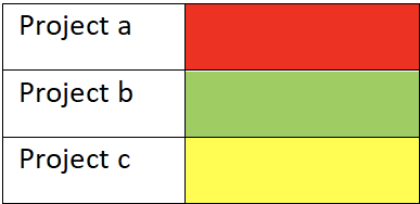
Sometimes we use color to convey meaning. For example, in the chart below:
Project Status (inaccessible example):
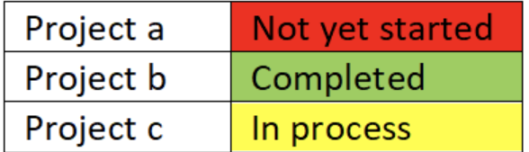
Project Status (Accessible example):
How to fix it:
When you are using color to convey meaning, simply add text alongside the color that describes the meaning.
Skill 3: Hyperlink
When adding hyperlinks into documents, the text that the link is attached to, should be clear, concise, and descriptive.
Accessible examples:
- The Office of Teaching and Learning offers resources to support inclusivity in the classroom.
- DU’s Disability Services Program supports students with disabilities in getting accommodations for equitable access.
Inaccessible Example (avoid these!):
- DU’s Disability Services Program supports students with disabilities in getting accommodations for equitable access. Click here. (Click here does not tell the reader where the link will lead them)
- The Office of Teaching and Learning offers resources to support inclusivity in the classroom: https://inclusive-teaching.du.edu/ (While this does tell the reader where the link will go, when a screen reader reads aloud this document, it is going to read out the entire link. It is annoying and interrupts the flow of reading).
How to fix it:
When adding in a hyperlink to a document, attach it to concise but descriptive text within your main text.
Skill 4: Document Structure: Styles (Headings) and Lists
When creating a document, you want to ensure that you are using built-in headings and lists.
Styles (Headings)
Under the home ribbon in Word, you will find a “Styles” tab. Built in styles are necessary to allow individuals with screen readers to navigate a document, and they also help everyone navigate a document.
Accessible example: This entire document. Go to the View ribbon and select the button next to “show navigation pane” on the left side, you will see that this document is organized using built in headings and is easy to navigate.
Inaccessible examples: Using underlined, bold, italic, or colored text to make “headings” or set apart sections of the document. While this is fine for someone sighted, an individual who is blind and using a screen reader will not know when one section ends and another begins.
How to fix it:
Find a place where you used bold, italic, or underlined text as a heading. Click anywhere on that line, then select the appropriate level heading from the styles bar.
Lists (numbered and bulleted)
Under the Home ribbon in word, there is a Paragraph tab. Housed in the Paragraph tab are built-in bulleted and numbered list features. Use these whenever making a list (note: Word usually will do this automatically).
Accessible examples:
Numbered list:
- Pumpkins
- Pie crust
- Cinnamon
- Milk
Bulleted list:
- Math 1010
- PYSC 2300
- ANTH 4550
Inaccessible examples:
Notice how they do not indent when you fail to use the built-in list feature.
Numbered list:
1 no pumpkins
2 no pie crust
3 no cinnamon
Bulleted list:
>> WRIT 3489
>>GEOG 6702
>>ENGL 3409
How to fix it:
Highlight your list. Then, select the appropriate button under the paragraph feature (bullets or numbers).
Skill 5: Alternate Text for Images
Adding alternate text for images allows individuals using screen readers to know the meaning of the image.
You can add descriptive text to images in two ways:
- Add Alternative Text (Alt text)
- Use captions: only when the description needs to be longer or is more complex.
Descriptive text should
- Describe the purpose and/or function of meaningful objects
- If the object is decorative or not meaningful, you should mark it as decorative or use a space or “ “ as the descriptive text.
- If the object is an image of text, then the alt text should match the text verbatim.
How to fix it:
Adding alt text:
- Right click on the image/object and click “edit alt text”
- Add meaningful descriptive text to the box.
- Description should be brief (250 characters or less). If it needs to be more in depth, then use a caption or description in the surrounding text to add descriptive text.
- If the image is decorative only, mark it as decorative using the check box
Skill 6: Tables
In order to make tables accessible, consider these things:
- Use the built in table feature under the Insert tab
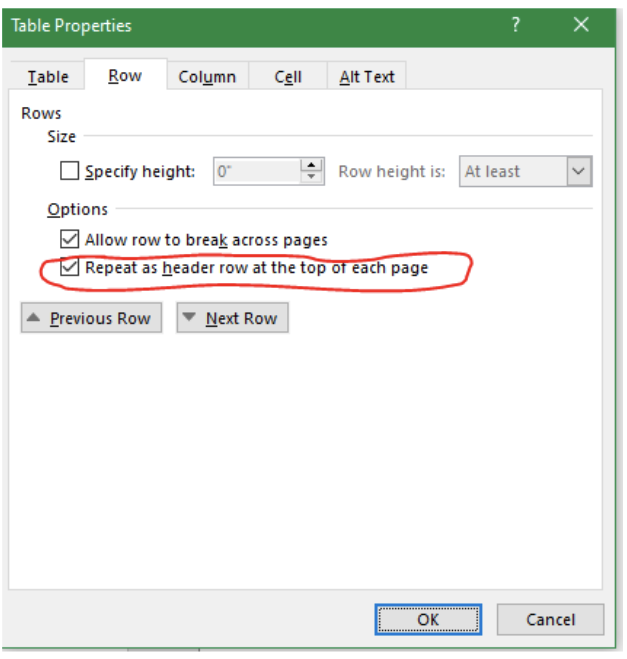
- Add in heading row: right click on the header row, then select properties. Select the Row tab and then check the box next to “repeat header row across top of page.” The row will not change visually, but is identified as a header row for assistive technology.
- Avoid merged cells and split cells—this makes it very difficult for individuals using screen readers to understand.
Example of an accessible table:
People Working Each Day
| Monday | Tuesday | Wednesday | Thursday |
| Bob | Juan | Mary-Sue | Noemi |
| Noemi | Mary-Sue | Bob | Juan |
Adapted from: Benecort, M.M., Ashburn, K. (2022, November 14-18). Digital Accessibility: Six Core Skills [Conference Presentation]. Accessing Higher Ground Convention, Denver, CO, United States.